

Behind The Shield Warner Brothers
The Warner Bros. logo is the production logo appearing at the beginning of films released by Warner Bros. and their various production divisions.
Contents
- 1 Overview
- 2 Logos
- 2.1 Main
- 2.2 Closing
- 2.3 Variations
- 2.3.1 Movies
- 2.3.2 Shorts
- 2.3.2.1 Warner Bros. Cartoons
- 2.4 Warner Bros. Family Entertainment
- 2.5 Warner Bros. Animation
- 2.5.1 Opening titles
- 2.5.2 Warner Bros. Feature Animation
- 2.5.3 Warner Animation Group
- 2.5.4 Kids' WB
- 2.6 Warner Sogefilms
- 2.7 Warner Bros. Television
- 2.8 Video games
- 2.8.1 Warner Bros. Interactive Entertainment
- 2.8.1.1 WB Games
- 2.8.1 Warner Bros. Interactive Entertainment
- 2.9 Warner Bros. Home Entertainment
- 3 Appearances in various productions
- 4 Openings from Films
- 5 Gallery
- 6 Trivia
- 7 References
Overview
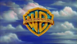
The logo contains a gold-outlined blue shield with the letters "WB" inside, surrounded by a gold banner reading "Warner Bros. Pictures", and set against a backdrop of clouds.
Logos
Main
| Picture | Description |
|---|---|
| Warner Brothers (1923-1925) | |
| | |
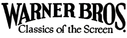
| Warner Brothers Pictures (1925–1929) | |
| | On a black background, a large, bizarrely shaped shield is seen, with a very wide top. The top part of the shield shows a picture of the Warner Brothers studio in Burbank CA, the bottom having a squashed, stylized "WB". "A WARNER BROTHERS" is above the shield (with "WARNER BROTHERS" in an arc around the shield, ala the first Columbia logo), with "CLASSIC of the SCREEN" below. Starting in 1926 or so, it changed to "PRODUCTION". |
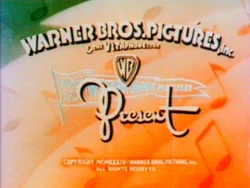
| Warner Bros. Pictures, Inc. (1929–1936) | |
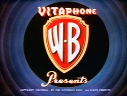
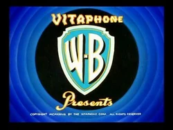
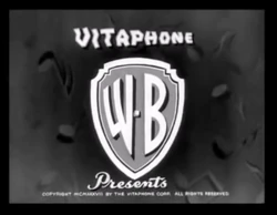
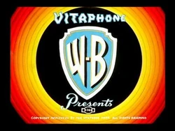
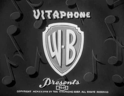
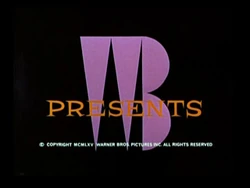
| | The words "WARNER BROS. PICTURES, Inc." appear, and below that "& THE VITAPHONE CORP." appears in a much smaller font, with the "VITAPHONE" using "electric" style letters. Below that is a very small WB shield (using the stylized WB seen in logo 1), and in script, "Present". Behind it there is the drawing of a flag, "waving" so it looks like it is in three sections. On the first one, "WARNER BROS." appears, followed by the electric-letter "VITAPHONE" logo and on section 3, "PICTURES". |
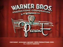
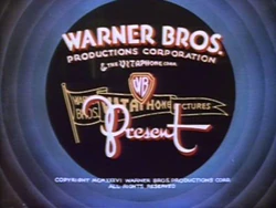
| Warner Bros. Pictures, Inc. (1934–1937) | |
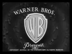
| | Over a cumulonimbus cloud setting, a superimposed WB Shield design zooms in to the screen. The words "WARNER BROS. PICTURES, Inc. Present" appear over the shield. For the prototype version, the shield is shaped extremely bizarrely. |
| | |
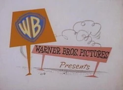
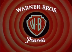
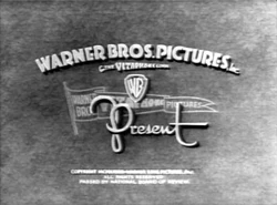
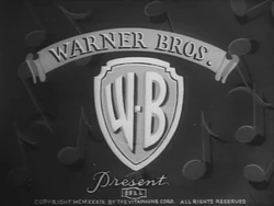
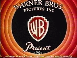
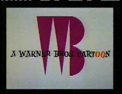
| Warner Bros. Pictures, Inc. (1937–1948) | |
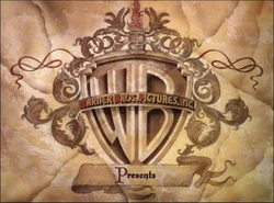
| | Inside a shield, a more realistic version of the stylized "WB" as seen in the previous logo appears. Over the shield is a banner that reads "WARNER BROS. PICTURES, INC." Below the logo is the word "Presents" in script. |
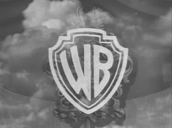
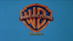
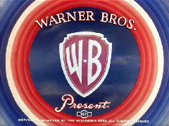
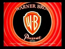
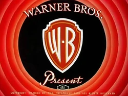
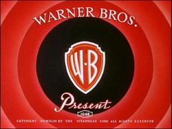
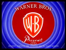
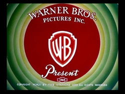
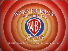
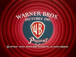
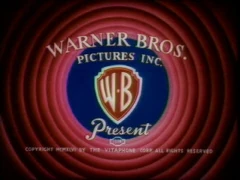
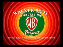
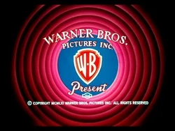
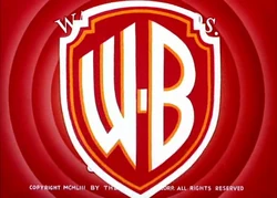
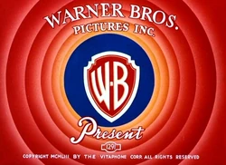
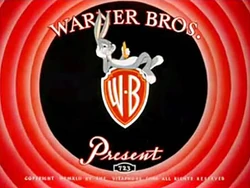
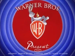
| Warner Bros. Pictures, Inc. (1948–1967) | |
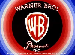
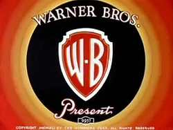
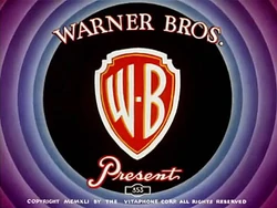
| | Same as the previous logo, only the design has been cleaned up a bit. The border of the shield, banner, text, and "WB" are now colored gold, and the inside of the shield is now blue. The banner phrase is now changed to "WARNER BROS. PICTURES" and is now gold. "Presents", in the same font as the previous logo, usually appears below. Also, the background is now a cloud skyline. For the later years, this logo was usually superimposed onto the titles of Warner features of this period. |
| | |
| | On 3D films and some 2D films that were originally planned to be made in 3D, the WB shield looks more three-dimensional. It was also used for logo plastering on older films for re-releases. |
| Warner Bros.-Seven Arts (1967–1970) | |
| | Just a superimposed, stylized shield which can be white, yellow or red. The shield features a combination of a "W" and a "7", representing Warner Bros.-Seven Arts. The "W7" is often drawn on-screen, a la the NBC Snake, although it's a still logo on a few films. Below the shield, "WARNER BROS.-SEVEN ARTS" is seen. The word "Presents" usually appears under the shield. |
| Warner Bros., Inc. A Kinney National Company (1970–1972) | |
| | Over a blue screen is an abstract shield in a golden color with a dark brownish color inside. A simple lettering of the WB appears at the upper part and a rectangle of the same colors appear at the lower part of the shield, with the Kinney byline inside. The word "PRESENTS" appears underneath the logo. |
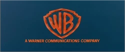
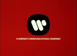
| Warner Bros. (1972–1973) | |
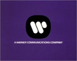
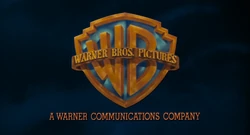
| | Just the standard gold WB shield logo but without the banner, posed on a blue background with "A WARNER COMMUNICATIONS COMPANY" underneath. "Presents", in script, may appear below. |
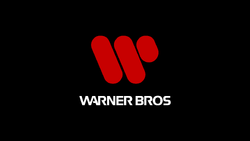
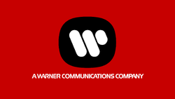
| Warner Bros. (1973–1984) | |
| | Aganist a black background, a red abstract "W" consisting of two slanted elongated circles and a shorter elongated circle zooms in towards us. Around halfway through, the words "WARNER BROS" (in the Warner Communications custom typeface) appear below it. The red logo overtakes the screen as a smaller white "W" zooms in. It stops at the middle of the screen and a black square field, whose corners have been rounded and softened, fades in around the logo. "A WARNER COMMUNICATIONS COMPANY" in the same font used for "WARNER BROS" fades in below. Most of the time, "PRESENTS" fades in below after that. |
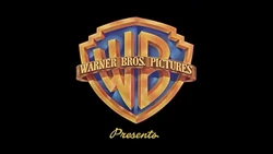
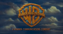
| Warner Bros. Pictures (1984–2001) | |
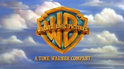
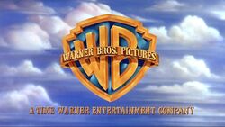
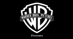
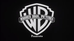
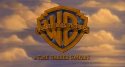
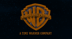
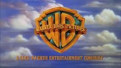
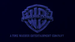
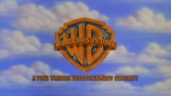
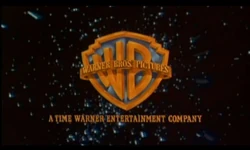
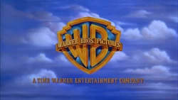
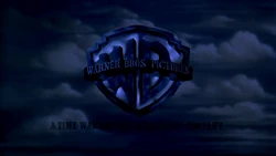
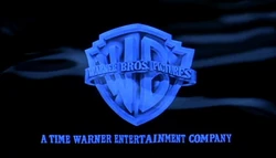
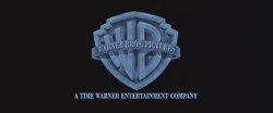
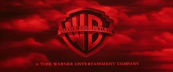
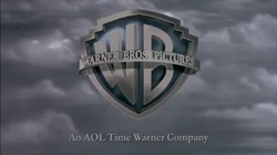
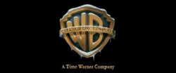
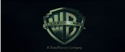
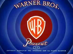
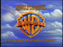
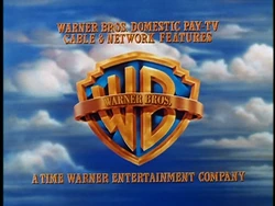
| | Against the backdrop of clouds is the gold WB shield (both are in their same styles from the 1948 logo) with a gold banner around it with the words "WARNER BROS. PICTURES". Below it is a byline that reads "A WARNER COMMUNICATIONS COMPANY" between 1984 and 1990. From 1990 until 1993, the byline reads "A TIME WARNER COMPANY", and from 1992 until 2001, the byline reads "A TIME WARNER ENTERTAINMENT COMPANY". On scope films, the backdrop of clouds is entirely different. The 1984 logo appears, as with all post-1999 Eastwood movies. |
| | |
| | |
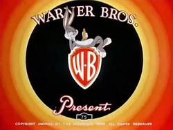
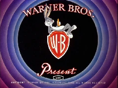
| Warner Bros. Pictures (1998–2021) | |
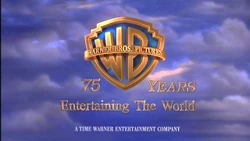
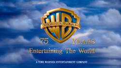
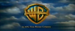
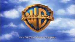
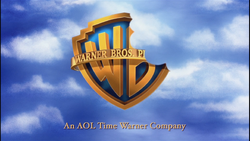
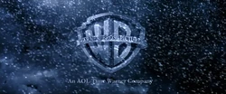
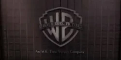
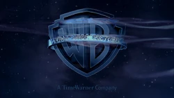
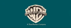
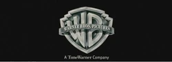
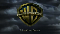
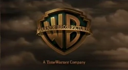
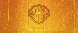
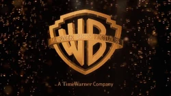
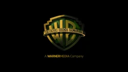
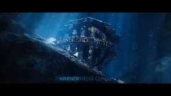
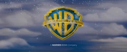
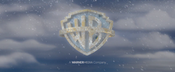
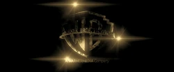
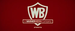
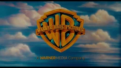
| | A image of the Warner Bros. studios is seen in gold tint with some posters present on the studio wall such as Lois & Clark: The New Adventures of Superman, Friends and Space Jam (the photograph was shot around late 1996) where it "ripples" before revealing to be reflected on the side of the WB shield with the banner reading "WARNER BROS. PICTURES" as it zooms out against the same backdrop of clouds (though the clouds are a little bit grey) and stops on it's position. "A TIME WARNER ENTERTAINMENT COMPANY" fades in underneath. This logo was animated by Intralink Film Graphic Design. For the logo's first year, to celebrate 75 years of Warner Bros., the shield zooms out to a more further position, "75" and "YEARS" appear from behind the shield and move away to surround it. "Entertaining The World" fades in underneath followed by the Time Warner Entertainment byline in white instead of gold and in a different typeface. Also, the background is slightly enhanced, and the shield has a slightly different lighting. There is also a rare variant for this logo's first year, where the banner only reads "WARNER BROS." instead of "WARNER BROS. PICTURES". From 2001 to 2003, the byline changed to "An AOL Time Warner Company". Then from 2003 until 2018, it was changed to "A TimeWarner Company" (though for a short time in 2003 until early 2004, it had the prototype byline) and from 2018 onward, it has "A WarnerMedia Company". Starting with Dolphin Tale, the logo was redone with the shield being sleeker, the banner being shinier, the byline being changed from gold to orange-yellow, and the animation of the shield being revealed is enhanced. |
| | |
| | |
| | |
| | |
| | |
| | |
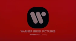
| Warner Bros. Pictures (2021–present) | |
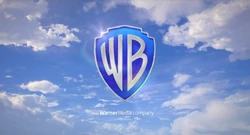
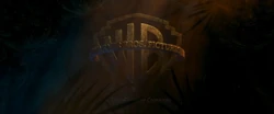
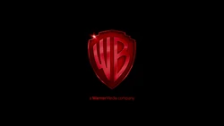
| | It starts off similar to the previous logo, but this time the Warner Bros. studios backlot is redone in photorealistic CGI at sunset (similar to the Searchlight Pictures logo), with the iconic water tower (displaying the new WB shield and reads "WARNER BROS. STUDIOS" in three rows on it and in the new corporate font called Warner Bros. Sans) taking centre-stage and is revealed to be reflected on the side of the brand new WB shield without the "ripple" and without the banner (the border of the shield and "WB" are now colored silver) as it zooms out against the brand new realistic backdrop of clouds (also redone in CGI) and stops on it's position. "A WarnerMedia Company" fades in underneath and the shield shines. There is a prototype variant where it starts with the same image of the Warner Bros. studios from the previous logo, before revealing to be reflected on the side of the new WB shield and zooms out against the same backdrop of clouds from the previous logo before the background fades to black and "A WarnerMedia Company" fades in underneath and the shield shines. |
Closing
Variations
Movies
| Picture | Description |
|---|---|
| (1935–1937) | |
| | |
| (1937–1948) | |
| | The shield is apricot and is surrounded by vines and plants. The latter has the lighter concept. |
| | |
| | |
| | The shield is light gray with the words Jack L. Warner Executive Producer in front and a black background. |
| (1948–1967) | |
| | |
| | The logo is white on a black background. It then morphs and shrinks to become a circle. |
| | |
| | The WB shield is inside a blue rounded rectangle with "PRESENTS" in a red rounded rectangle, amongst other colorful rounded rectangles. |
| | The bannerless WB shield is on a red-orange sign, and the words "WARNER BROS. PICTURES", in a cartoon-ish font, are on a bright red sign, with the word "Presents" in a red script font below. |
| | |
| | |
| | The bannerless WB shield is tinted dark gray with the words Warner Bros. Pictures Presents in a white cursive font and a background full of flowers. |
| | |
| | The shield is put on a black background and is in black & white. |
| (1970–1972) | |
| | Both variants has the logo in gold on a brown book: At the beginning, as we zoom out, we see a hand opening the book to the inside cover, and then to text which says "Warner Bros., A Warner Communications Company Presents". At the end, the final page reads "Distributed by Warner Bros.". The book is then closed. |
| (1972–1984) | |
| | The shield appears on a black background and suddenly bursts into flames as the logo fades out. |
| | |
| | The 1972 logo is on a purple background. |
| | The 1948-1967 WB shield zooms in on a cloudy background while the classic 30's fanfare plays in the background. Seen after the 1979 Orion/WB logo. |
| | It starts with the regular logo, then it has the 1972 logo with a circle of the 1940s cartoon logo which comes out of the 1972 logo. |
| | |
| (1984-2001) | |
| | At the beginning of the former (After the opening song segment), we get a brief 2-D animated segment where a cartoon Big Bird finds an air pump and a balloon. He inflates the balloon and it turns out to be a "W", which pops off and flies into the sky, where it morphs into the "W" in the "WB" shield as the rest of the shield forms around it. While this happens, Big Bird announces that "Sesame Street is brought to you today by the letters W and B." At the end of the former, the closing in-credit logo is yellow. This also appears on the latter title, with John Williams' Superman theme playing over it. |
| | The logo turns crudely drawn, with wiggling clouds. The byline & clouds dissipate as an evil-looking animated pink bunny, who wears a red-white striped helicopter cap (like the one seen in the following movie) and has the picture of a No Rhino sign on his body, opens the shield from inside. He laughs, and then we zoom into his mouth, seeing the opening title zoom in toward us, transitioning to the opening. |
| | |
| | The Warner Bros. logo with byline appears as animated on a granite background. We zoom up to the logo, the shield opens like a door, and out comes a cartoon Madonna, who closes the shield and poses sexy for the camera. The logo goes up and she moves down to make way for the opening credits. |
| | |
| | The WB shield is a metallic orange and the byline is in a different font. The background fades to the opening shot and the logo fades out. |
| | |
| | |
| | |
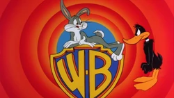
| | Instead of the normal shield logo, a replica of the classic 1936-1964 WB "circles" cartoon logo comes up, with its text and minus the shield ("PICTURES, INC." is removed in favor of "A TIME WARNER COMPANY"). The shield then zooms up with Bugs Bunny riding it, and the text fades out. Daffy Duck then comes on screen, angrily pushes him off the shield ("50 years of you hogging the spotlight is ENOUGH!"), and tries to ride it... well, it doesn't work as good for him :) They also have another Looney Tunes-style ending, with Porky doing the usual "That's all Folks!" ending before Daffy, like before, complains of Porky hogging (no pun intended) the spotlight, saying "60 years of hogging the end title is enough". Daffy tries to say the end line, but like before, is stopped when the shield with Chuck Jones' credit comes out, hitting him in the face. He gets back up and weakly says "Fade out." |
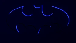
| | The shield transforms into the Batman logo. |
| | |
| | |
| | |
| | The Warner Bros. Pictures logo was used in the space during the theatrical trailers of Space Jam. |
| | |
| | The shield appears from the dark, stormy clouds. Note: This only appeared in the US version as the Universal Pictures variant only appears outside of the US. |
| | A little flying saucer flies around the shield. |
| | The shield is in a dark crystal blue color, and the sky is in dark blue. |
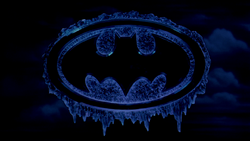
| | The shield transforms into a frozen Batman logo. |
| | |
| | |
| | |
| (1998–2020) | |
| | The music is off sync with the logo. After the music is over, the shield explodes into a fireball, transitioning into the opening title sequence. |
| | |
| | The shield & text is covered with snow and ice. Also, the cloud background is tinted in nighttime red. A Prototype version for the trailers and TV spots, the cloud background is tinted in daytime blue. |
| | |
| | After the logo is formed, everything except the shield fades to a a grainy light blue background where the shield becomes pixelated before it zooms out, revealing to be one of the computer icons in the computer home screen (with one of them being the American Online icon, which is a coincidence because Time Warner would merge with AOL in 2001). The logo has the music replaced with computer sounds, such as a photocopier and scanner, which were deliberately made to sync up to the logo's animation. |
| | |
| | |
| | The 1984 shield appears from the smoke during the trailers of The Matrix. |
| | The logo is tinted in green and the graphics altered so they look "computerish". |
| | Before the logo is even faded completely, the background turns black while the shield turns into the 1984 shield, and water starts to appear on the shield. |
| | This and the following Village Roadshow logo aren't animated. Also, they are put on a black background, and the logos are in the same light blue color scheme as the first five minutes of the movie. The font in this logo differs, as well. |
| | |
| | The logo comes up looking like an amoeba with tentacles. |
| | |
| | The logo is tinted in light gray. |
| | The logo is slightly dimmed compared to the normal version. |
| | |
| | |
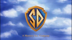
| | The logo animates as normal, but the cloudy background is brighter and different (similar to the cloud background of the 1984 logo). When a chunk of the shield disappears with a chomping sounds as if it were bit out, the music stops abruptly and we hear Scooby-Doo do his famous laugh, and then a zoom out has the shield turn into a Scooby-Doo dog collar with the initials "SD" on it. Underneath is a "A Mystery Inc. Company" byline. |
| | |
| | |
| | |
| | |
| | |
| | The logo is black and white and the background is a cloudy sky. |
| | The shield appears high in the clouds as the camera zooms through it. |
| | The opening logos are tinted brown, and the typical Warner Bros. logo is instead an intentionally chintzy 50s style logo. Also, the byline is in the ITC Garamond font. |
| | In Blood Work, the Warner Bros. logo is the 1984 logo with "An AOL Time Warner Company" on the bottom. This logo is also used in Gods and Generals. |
| | |
| | The bylineless logo stands still on a black background in black and white. |
| | |
| | |
| | The sky background is replaced with water. Also, the beginning of the logo is colored aqua blue, but when the shield is revealed, the shield turns into its normal colors. |
| | The background fades into the city of Los Angeles skyline, leaving only the WB shield. |
| | The logo is covered in snow. |
| | |
| | |
| | |
| | Just the normal logo with the prototype byline but everything but the shield fades out and we see the shield zooming out on the red rings that immediately make you think "Looney Tunes." The title appears on the rings. Over this variation is the classic instrumental composition of "What's Up, Doc?" |
| | |
| | |
| | |
| | Just the 1998-2020 Warner Bros. logo with the "TIME WARNER" byline in the same font used during the AOL Time Warner era, but in a sky blue and black color scheme. |
| | The logo is tinted in leyden blue. |
| | The shield is icy on a black background and is still or "frozen". |
| | |
| | |
| | The logo is leyden blue and put on a night sky background. Also, the logo turns into the moon and isn't animated. |
| | |
| | |
| | The clouds behind the WB shield are gray instead of white and the logo isn't animated. |
| | |
| | |
| | |
| | |
| | |
| | |
| | |
| | |
| | The WB logo is in stone and a mock version of the theme "As Time Goes By" is heard during the first six seconds. |
| | The logo is transparent and put on a background of beer, along with the Legendary Pictures logo. |
| | |
| | |
| | |
| | The WB shield appears like a machine, then opens to space. |
| | |
| | The logo is dark turquoise and is lit up from a spotlight with a paw on it. |
| | The shield is in silver on a cloudy sky background. |
| | The shield is a tan color, and is set on a bubbly beer background. Also, the logo fades as soon as the shield stops moving. |
| | The logo starts as normal, then the shield is revealed to be in outer space, and the blue inside is replaced with green energy. |
| | |
| | In Magic Mike and Magic Mike XXL, the original 1972 logo is used, but "A TimeWarner Company" fades in below the logo instead of "A Warner Communications Company". In Argo, it's exactly the same as the Magic Mike variant, but a bit darker. In The Nice Guys, it's exactly the same as the Magic Mike and Argo variants. And in Joker, the same logo is used, but with design alternations and fades in text "Warner Bros. Pictures" below the logo in addition to "A WarnerMedia Company" text below it. |
| | |
| | |
| | The shield from "The Young Philadelphians" is in a red color. Also, the logo is seen drawing by itself and the TimeWarner byline fades in below. Then, a red rectangle takes it off and creates the RatPac Entertainment logo. |
| | |
| | |
| | |
| | |
| | |
| | |
| | The studio backlot is slightly different, as the logo is grayscaled. During the rotation, the WB shield on the backlot lights up (similar to a neon sign). As the shield turns, it takes place in a different moving sky backdrop. But, the logo then glitches as the rest of the logo takes place in the lighted up background with the byline already there. The logo then glitches out. |
| | |
| | |
| | The logo takes in the underwater background, with bubble effects. |
| | |
| | The logo is textured with green snakeskin. |
| | |
| | The logo starts off aqua blue and when it zooms out, the logo is aqua blue underwater and half of it is wedged in a rock. The company's name can still be seen. The byline is also aqua blue. The camera zooms past the logo and transitions to the DC logo. |
| | The logo's background turns windy and the shield freezes solid. The shield then shatters to reveal the Warner Animation Group shield. The shield appears on a snowy background. The WarnerMedia byline is dark blue. |
| | |
| | |
| | |
| | The logo is grungy and on a black background while the Deadlights float around. |
| | The 1970 Kinney Shield logo animates a la the 1972 "\\'" logo. Also, when the logo finishes animating, the WarnerMedia byline fades in on the box part of the logo and the word "presents" fades in below the Kinney Shield logo. |
| | |
| | |
| | |

Shorts
Warner Bros. Cartoons
| Picture | Description |
|---|---|
| 1929-1936 | |
| | |
| | |
| | |
| | |
| 1936-1941 | |
| | |
| | |
| | |
| | |
| | |
| | |
| | |
| | |
| | |
| | |
| | |
| 1941-1945 | |
| | |
| | |
| | |
| | |
| | |
| | |
| | |
| 1945-1953 | |
| | |
| | |
| 1953-1964 | |
| | |
| | |
| | |
| | |
| | |
| 1961-1967 | |
| | |
| | |
| | |
| | |
| 3-D Version | |
| | The WB shield was animated as if it zoomed up close to the audience. |
| | |
| Bugs Bunny's variants | |
| | |
| | |
| | |
| | |
Warner Bros. Family Entertainment
| Picture | Description |
|---|---|
| (1992-2001) | |
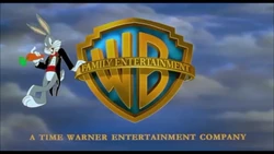
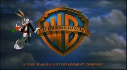
| | Against the classic backdrop of clouds, the WB shield is posed with the banner reading "FAMILY ENTERTAINMENT" instead of "WARNER BROS. PICTURES". The byline "A TIME WARNER ENTERTAINMENT COMPANY" fades in under the logo and Bugs Bunny dressed in a tuxedo steps to the left from under the shield, does a Vanna White-like pose, and puts his hand on the banner as he leans, brandishes a carrot and takes a bite on it as the banner shines. There is also a variant on some movies such as Dennis the Menace, Free Willy, The Nutcracker, Thumbelina and A Troll in Central Park, where the shield has no banner at first (similar to the 1972 Warner Bros. Pictures logo), then Bugs leans over and places a hoop-like wordless banner on the shield and spins it around. Then the byline fades in and the ribbon stops, revealing the inscribed words above. Also, the shield is a bit smaller. |
| (1998-2009) | |
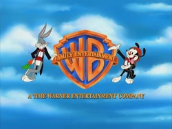
| | Nearly the same as the 1998-2021 Warner Bros. Pictures logo, the only differences are that the shield banner reads "FAMILY ENTERTAINMENT" instead of "WARNER BROS. PICTURES", and Bugs steps to the left from under the shield, doing the same pose and animation from the previous logo. The byline fades in below. During Warner Bros.' 75th Anniversary, the logo uses the "75 YEARS" variant from the Warner Bros. Pictures logo, but the differences are the background being darker, the shield along with the text is darkened to a brown-gold color and the animation of Bugs Bunny is added. This was only seen on Quest for Camelot, A Rat's Tale, Dennis the Menace Strikes Again! and the trailer for The King and I. Until 2001, "A TIME WARNER ENTERTAINMENT COMPANY" byline is used before it is replaced by "An AOL Time Warner Company" and then in 2004 "A Time Warner Company". Other times from 2003 until 2008, the logo is byline-less. |
| | |
| | |
| | |
| | |
| | |
| | Right after Bugs does his standard pose, Wakko Warner appears on the other side of the shield and takes a big bite out of it as Bugs looks on. |
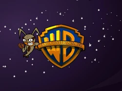
| | Right after Bugs takes a bite of his carrot, the camera fades to a dark starry sky with The Flea leaning on the shield and eating a doughnut in the same fashion. |
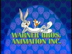
Warner Bros. Animation
| Picture | Description |
|---|---|
| | |
| | |
| | |
| | |
| | |
| | |
| | |
| |
Opening titles
| Picture | Description |
|---|---|
| |
Warner Bros. Feature Animation
| Picture | Description |
|---|---|
| (1999) | |
| | The WB shield without the banner (similar to the 1972 Warner Bros. Pictures logo) zooms through the red Looney Tunes rings as the banner fades in over the shield reading "FEATURE ANIMATION" instead of "WARNER BROS. PICTURES". The shield then stops in its place as "A TIME WARNER ENTERTAINMENT COMPANY" byline fades in, then the rings fade out one-by-one when the WB shield turns dark and fade out. On the pan-and-scan version of the film, the logo has an open-matte version. On a crew reel as well as the Brad Bird voice over on a trailer, a prototype version of the logo is used. This was only seen on The Iron Giant since the film was originally going to use the Family Entertainment logo, but director Brad Bird was against this, and the custom variant of the logo was used in the film. |
| | |
Warner Animation Group
| Picture | Description |
|---|
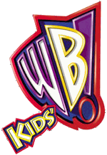
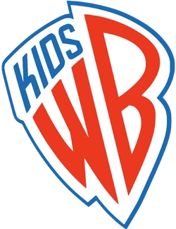
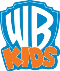
Kids' WB
| Picture | Description |
|---|---|
| 1995-1997 | |
| | |
| | |
| 1997-2001 | |
| | |
| 2001-2008 | |
| | |
| 2008-2010 | |
| | |
| 2010-2016 | |
| | |
| 2016-present | |
| | |
Warner Sogefilms
| Picture | Description |
|---|---|
| |
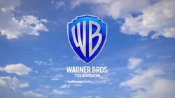
Warner Bros. Television
| Picture | Description |
|---|---|
| | |
| | |
| | |
| | |
| | |
| | |
| |
Video games
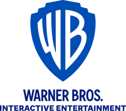
Warner Bros. Interactive Entertainment
| Picture | Description |
|---|---|
| | |
| | |
| |
WB Games
| Picture | Description |
|---|
Warner Bros. Home Entertainment
| Picture | Description |
|---|---|
| | |
| | |
| |
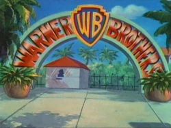
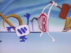
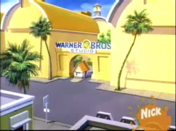
Appearances in various productions
| Picture | Description |
|---|---|
| Tiny Toon Adventures | |
| | |
| | |
| | |
| Batman: Mask of the Phantasm | |
| | The Warner Bros. Shield logo makes a cameo appearance in the abandoned World of the Future Fair during Batman chasing the Joker in Batman: Mask of the Phantasm. |
Openings from Films
Gallery
")
Warner Bros. 1935 logo.
")
The logo from 1984 to 2001 using one of the bylines for example; "A TIME WARNER ENTERTAINMENT COMPANY"
.png (1.05 MB)")
The logo's end card from 1992 to 2000
")
The 75 Years logo used in 1998
![]()
The original CGI logo with the byline "A TimeWarner Company" used from 2004 to 2018
![]()
The updated version of the theatrical logo with the current byline used from 2018 to 2021
.png (1.71 MB)")
The current CGI logo with the byline "A WarnerMedia Company"
![]()
Offical print Logo
![]()
Another print Logo
![]()
")
")
The logo's end card from 2004 to 2018
.png (603 KB)")
The logo's end card from 1990 to 1992
")
The logo's end card from 2001 to 2003
")
![]()
")
")
![]()
")
")
")
")
")
")
")
")
![]()
")
")
.png (23 KB)")
")
.png (45 KB)")
")
")
")
")
![]()
![]()
![]()
![]()
")
")
")
")
![]()
![]()
The logo's end card from 2000 to 2001
")
The logo's end card from 2018 onward
![]()
")
![]()
![]()
Trivia
References
Behind The Shield Warner Brothers
Source: https://warnerbros.fandom.com/wiki/Warner_Bros._logo
Posted by: thompsonfacticked.blogspot.com
0 Response to "Behind The Shield Warner Brothers"
Post a Comment